Balancing Vintage Charm with Modern Foundations
Blending old and new in your home doesn’t have to mean chaos. The key is smart contrast: letting standout vintage pieces shine while grounding your space with timeless modern forms. In 2024, it’s all about building harmony—not matching styles, but balancing them.
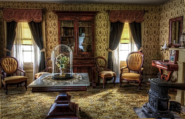
Start with a Statement
A vintage focal point brings soul to a room—especially when it has a story to tell.
- Heirloom storage: Think a worn-in wooden chest, antique armoire, or hand-carved sideboard.
- Mid-century magic: A credenza or dresser with classic contours can anchor even the most modern setting.
- Patina meets personality: The imperfections and character of vintage add depth to newer spaces.
Build Around a Modern Foundation
Once your vintage element is in place, you’ll need anchoring pieces that create consistency and flow.
- Sleek sofa: Choose neutral tones or clean lines that don’t visually compete.
- Minimalist dining table: Wood, glass, or stone materials work well with a range of vintage styles.
- Keep the palette restrained: Focus on 2–3 core tones to unify contrasting elements.
Choosing the Right Anchor
When merging distinct eras, intentionality is everything. To avoid visual clashes:
- Let one piece lead: Start with either your vintage or modern choice—don’t pick both at once.
- Match intensity, not style: A bold vintage cabinet can pair with a strong modern sofa, as long as the room’s energy stays consistent.
- Play with balance: Mix curved lines with straight, warm surfaces with cool ones, old finishes with new silhouettes.
A well-edited, intentionally layered space tells a story—and that story begins when design elements from different decades speak the same visual language.
Perfect match sounds good on paper—but in front of a camera, it often falls flat. That all-beige palette or ultra-sleek, color-coordinated background might look polished, but it rarely pops. It fades into forgettable. In 2024, vloggers are realizing that contrast, not uniformity, is what grabs attention and holds it.
This is where personality steps in. That vintage lamp with the modern desk? The punk playlist playing behind a calm meditation vlog? These unexpected combos do more than decorate—they tell viewers who you are. Getting personal with your space invites loyalty. It makes your content feel lived-in and real.
The old-meets-new aesthetic is thriving because it tells a story. A story of now rooted in then. Whether it’s retro VHS filters on 4K footage or antique frames behind a neon mic, mixing eras creates an intentional kind of friction that draws people in. Viewers want to understand your world, not just scroll past it. Give them something to feel.
Layering modern and vintage elements in style can go beautifully right—or wildly wrong. The key is picking a solid base, then letting the other style add contrast without taking over. Start simple: decide if you’re anchoring your look in modern minimalism or vintage flair. Then, build around that.
For example, a clean, monochrome outfit (modern base) becomes more character-driven with a well-worn 70s denim jacket or bold retro accessory. On the flip side, if you’re leaning vintage—think pleated trousers or a thrifted blouse—modern sneakers or sleek techwear can ground the look in the now.
What wrecks most layered fits is too many loud pieces fighting for attention. Avoid visual chaos by sticking to one clear focal point and keeping textures or colors aligned. Let one style lead. Let the other surprise. That tension, when handled right, is where personal style gets interesting.
Balance Is the New Bold: Mixing Styles with Intention
In 2024, interior aesthetic is less about strict themes and more about thoughtful contrasts. Creators and homeowners alike are finding beauty in striking juxtapositions—pairing old with new, raw with refined, and bold with subtle.
Modern Lighting Meets Retro Character
A current visual trend: combining sleek, sharp lighting fixtures with vintage furniture pieces. This approach creates a dynamic visual tension that adds depth and personality to a space.
- Use sculptural or minimalist lighting to update a thrifted or inherited furniture item
- Floor lamps and pendant lights with metal or glass finishes stand out against rich wood or velvet textures
- Sharp lines from lighting add a fresh edge to otherwise cozy, retro corners
Industrial + Antique: When Opposites Attract
Blending industrial and antique styles isn’t an accident—it’s an art. When done right, it tells a layered story that feels both grounded and elevated.
- Raw materials like concrete, steel, or exposed brick give a space authenticity
- Antique elements like ornate mirrors, aged leather, or patina finishes soften and enrich these hard surfaces
- Together, they create contrast that feels curated instead of chaotic
Let One Piece Lead the Room
Great style doesn’t mean maximalism. Choose a single focal-point item that anchors the space and gives it purpose—everything else should enhance, not compete.
- Identify your “wow” piece: a vintage armchair, an oversized art print, or a designer light fixture
- Keep supporting pieces streamlined and neutral to let the star shine
- Aim for visual hierarchy in your styling, not visual noise
The result? A cohesive, dynamic room that feels intentional rather than over-styled. Mixing design eras, finishes, and philosophies can work beautifully—as long as you allow each piece its moment and trust contrast as a design tool.
Use Matching Tones to Bridge Style Gaps
Blending design styles isn’t about forcing opposites to get along—it’s about tone. When mixing eras or aesthetics, the secret is choosing materials and colors that speak the same visual language. Think warm leathers with vintage patina playing off matte black hardware. Or a mid-century walnut table grounding a room filled with industrial light fixtures. If the tones align, the mix feels deliberate.
Wood, metal, and fabric all carry signals. A cool-toned birch finish pairs better with brushed chrome than with antique brass. Velvet reads differently than cotton duck or leather. Understanding how these surfaces reflect light—and how they feel—keeps even a bold mix from looking disjointed.
Pro tip: distressed finishes are your best friend when bridging crisp modern lines with lived-in vintage textures. They soften sharp geometry and make the whole room feel a little more personal, a little less showroom-perfect.
Cushion covers, lighting, and rugs aren’t just finishing touches—they’re your secret weapons when blending styles. Whether you’re pulling together modern minimalism with vintage charm or industrial edge with cozy comfort, these are the items that stitch it all together without forcing a full redesign.
Start with textiles. Cushion covers are cheap, versatile, and easy to swap out. Stick with fabrics and prints that echo both vibes you’re working with—think linen with graphic patterns, or muted tones with bold geometry. Rugs work the same way. A flatweave with organic textures can ground a high-contrast space or tone down louder elements.
Lighting might be your smartest investment move. It sets tone, adds personality, and makes almost everything look better. A sculptural floor lamp or well-placed pendant warms up sterile environments and adds interest. You don’t have to spend a fortune, but don’t go bargain-bin either—bad lighting kills a good mood fast. For ideas that actually work, check out Lighting Ideas That Instantly Elevate Any Room Design.
Bottom line: don’t sink your budget into expensive furniture if cohesion is your goal. Focus on the details that make the space feel intentional. That’s where transformation actually happens.
Design Mistakes That Weigh Down Your Space
Blending furniture from different eras can look intentional and artful—but only when there’s a thread pulling it all together. If you’re pairing a mid-century modern credenza with a French provincial armchair and a Bauhaus coffee table, something needs to unify the chaos. Color, texture, or shape can connect the dots. Without that, the room ends up feeling like a thrift store exploded.
Another misstep: chasing trends like they’re going out of style (because they usually are). That bubblegum-pink boucle chair may be everywhere right now, but will you still like it in two years? Focus on core pieces that can ride out the trends, then layer in statements sparingly. Timeless doesn’t mean boring—it just means you won’t regret your purchases every time Instagram resets its taste level.
Lastly, too much decor kills the vibe. Stacking books, trinkets, frames, throws, and pillows on every surface doesn’t make the space feel rich—it makes it feel busy. Let your favorite pieces breathe. Negative space is part of the design. You’re not trying to fill every inch. You’re trying to tell a story people want to stay in.
Design isn’t just what’s trending—it’s what surrounds you every day. That means showing who you are, not just what you bought. A wall with mismatched frames holding old family photos tells a deeper story than a polished print from a catalog. That offbeat art piece from a road trip? Put it in the hallway. Even modern prints feel different when they sit next to something that’s been in your family for decades.
This is where vintage-modern really works. The hard lines of contemporary pieces soften when paired with well-worn textures. Think minimalist shelves holding old cookbooks. Sleek lighting above a weathered farmhouse table. If done right, the space lives like a scrapbook—functional, lived-in, and full of character. Not overwrought. Not curated to death. Just real.
There are no hard rules here, and that’s exactly the point. Live in the space. Let it evolve. And let your stuff say something true about you.