Earthbound Neutrals Are Back (But Not Boring)
A Shift in the Neutral Palette
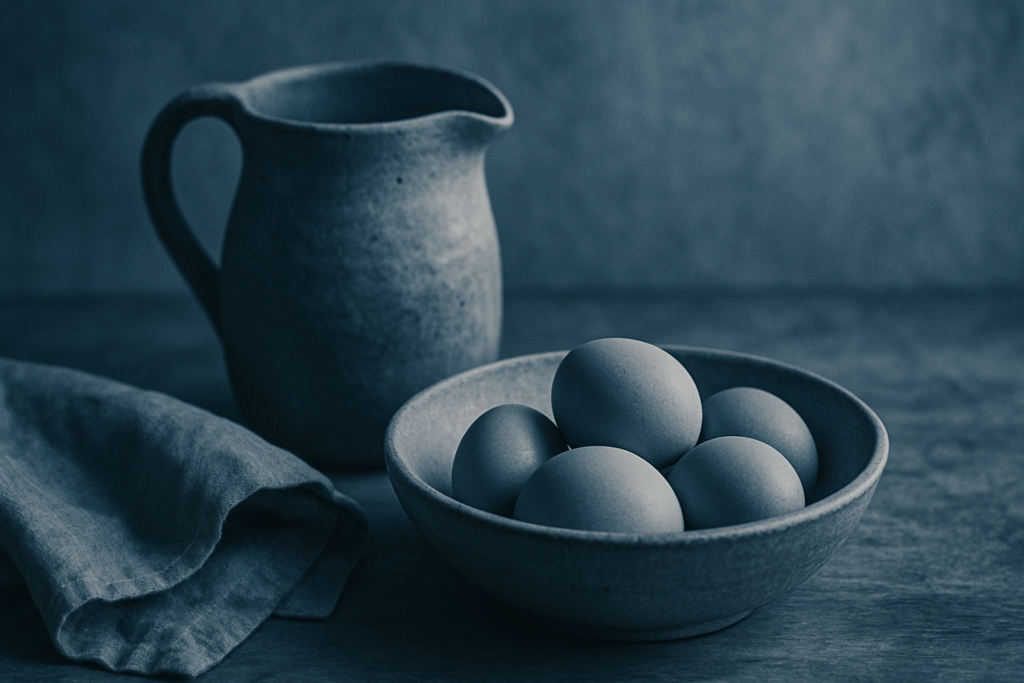
Interior design is moving away from clinical whites and cool grays. In their place, earth toned neutrals are taking center stage think warm taupes, sand tones, and clay inspired hues. These shades offer a grounded, comforting aesthetic that feels both modern and timeless.
Warm taupes add subtle depth without overwhelming a space
Sand tones mimic natural light, enhancing an open, airy feel
Clay inspired colors introduce an understated richness
The Why Behind the Hue
These nature drawn tones do more than look good they work hard to create a calm, centered atmosphere.
Promote relaxation and reduce visual overstimulation
Serve as versatile backdrops in both minimalist and textured interiors
Transition well through changing seasons and trends
How to Style Earthbound Neutrals
Pair these calming tones with contrasting elements to keep a space from feeling flat or over muted:
Matte black fixtures: Introduce light drama and an edge of modernity
Natural wood accents: Add texture, warmth, and organic flow
Textiles in tonal layers: Think linen curtains, boucle throws, or wool rugs in complementary hues
Want to compare with last year’s trend palette? Explore the 2025 evolution
Bold Blues with Depth
Deep navy and ocean inspired blues are carving out serious space in modern interiors. These aren’t just safe accent colors anymore they’re leading players. Used boldly, they transform a wall into a focal point or turn kitchen cabinetry into moody showpieces with character.
While the hues are dramatic, they’re surprisingly versatile. Paired with brass hardware, they take on a refined edge. Add in white oak elements, and the combo walks the line between coastal cool and urban sophistication. That balance is exactly what’s making these blues essential in 2026: enough intensity to feel fresh, grounded enough to feel timeless.
Soft Tech Greens: The New Digital Calm
Mint, pistachio, and powdered sage aren’t just trendy they’re the palette for a new kind of balance. As our homes turn into command centers packed with screens, software, and noise, these cool toned greens step in as the counterweight. They soften the edge without losing clarity.
The appeal? They’re fresh without feeling sterile. Mint cools the edges of a cluttered brain. Pistachio brings a hint of energy without being loud. Powdered sage wraps it all in a fog of calm. Together, they’re showing up in the spaces where people need to stay alert but not anxious: home offices, bedrooms, and studios.
Think of them as the color equivalent of noise canceling headphones cutting the static so you can stay focused. Even a single wall painted or a throw pillow swapped in can bring just enough green to reset the vibe.
Mars Inspired Reds & Ochres

Burnt sienna, brick red, and buttery ochre are making a quiet but confident comeback. These aren’t loud tones they’re grounded, matte, and carry a steady warmth that modern interiors have been missing. They evoke craftsmanship, sunbaked landscapes, and age old materials without feeling dated.
Used right, they add a richness that balances sterile grays and overdone beiges. The key is restraint. One heavy textured burnt sienna throw. A curved doorway in soft ochre. A brick toned lounge chair that commands a corner. These reds and yellows layer beautifully with linen, walnut wood, and aged brass no need to go full Tuscan revival.
They work best as accents: textiles, curved archways, and statement furniture hold the color without letting it hold the room hostage. Think texture over saturation. That’s how you build depth without going heavy handed.
Reimagined Pastels, Grown Up Edition
Pastels aren’t just for nurseries anymore. In 2026, lilac, soft peach, and powder blue are stepping into modern interiors with quiet confidence. These shades feel clean, refined, and a little unexpected exactly what you want when trying to dial down a harsh space without falling into bland territory.
Designers are leaning on these tones to soften minimalist palettes and bring warmth into Japandi inspired rooms. They layer beautifully with light woods, off whites, and geometric forms, creating a space that feels lived in but not overdone.
If your room lacks natural light, these colors work overtime. Their reflective quality brightens dim corners without artificial glare, making them ideal for basements, shaded bedrooms, or north facing studios. Keep the finish matte or eggshell, and you’ll avoid any chalky throwback vibes.
Charcoal & Dusty Black: Not Just for Kitchens
Charcoal is having a quiet moment and it’s stepping out of the kitchen. Designers and homeowners alike are bringing this deep, moody tone into places it rarely used to go: living rooms, guest baths, even main bedrooms. It’s the kind of color that demands attention, but with a restraint that black can’t always offer.
What makes charcoal work is its ability to ground a space without pulling it into darkness. Pair it with soft neutrals like greige or warm ivory, and the contrast feels intentional, not stark. It also plays well with texture glass, stone, even aged metals letting finishes do some of the heavy lifting. If you’ve been looking to add depth without committing to full on noir, charcoal is the middle ground that delivers.
It’s bold. It’s balanced. And it’s here to stay at least for this design cycle.
Adaptive Color Zoning
Open plan living isn’t going anywhere, but the way we organize those spaces is evolving fast. In 2026, smart color zoning is the quiet revolution helping people define purpose without picking up a hammer. Teal reading nooks, olive toned prep stations in the kitchen, a clay pink yoga patch in the corner all subtle, intentional shifts using color as structure.
It’s minimal effort with major payoff. By painting a portion of the wall or even furniture in contrasting hues, you create flow and break up the monotony of wide, empty zones. It’s a budget friendly fix with high design impact, and it’s especially effective in apartments or smaller homes where square footage is limited but function matters.
Compared to last year’s softer zone trends, 2026 is dialing up contrast. More saturation, more intentional pairings, less beige blending. Want to split your living room from your work from home corner? Pick two tones from the same family but vary intensity. It’s an instant layout redraw no construction required.
(Compare with last year’s trends: interior color forecast)
Staying Ahead of the Cycle
Color trends aren’t sticking around like they used to. What used to evolve every 3 to 5 years is now flipping in less than two. Thanks to faster trend cycles, driven by social media and global design cross pollination, we’re seeing major shifts every 18 24 months. For anyone reworking a space or advising clients who are the message is clear: don’t chase every wave.
Instead, think in layers. Invest in classic backdrops: neutral sofas, timeless tile, natural wood flooring. Then bring in current colors through paint, throw pillows, artwork, or even cabinet doors. These are easier (and cheaper) to replace when the next palette trend rolls in.
Timeless doesn’t mean boring it’s the smart foundation. The real risk is going all in on a bold hue for something expensive or permanent. Accent with confidence, anchor with restraint. That’s how you build a room that still works three trends from now.
 Ask Ireneia Diamondolls how they got into home repair tips and you'll probably get a longer answer than you expected. The short version: Ireneia started doing it, got genuinely hooked, and at some point realized they had accumulated enough hard-won knowledge that it would be a waste not to share it. So they started writing.
What makes Ireneia worth reading is that they skips the obvious stuff. Nobody needs another surface-level take on Home Repair Tips, Creative Concepts, DIY Renovation Ideas. What readers actually want is the nuance — the part that only becomes clear after you've made a few mistakes and figured out why. That's the territory Ireneia operates in. The writing is direct, occasionally blunt, and always built around what's actually true rather than what sounds good in an article. They has little patience for filler, which means they's pieces tend to be denser with real information than the average post on the same subject.
Ireneia doesn't write to impress anyone. They writes because they has things to say that they genuinely thinks people should hear. That motivation — basic as it sounds — produces something noticeably different from content written for clicks or word count. Readers pick up on it. The comments on Ireneia's work tend to reflect that.
Ask Ireneia Diamondolls how they got into home repair tips and you'll probably get a longer answer than you expected. The short version: Ireneia started doing it, got genuinely hooked, and at some point realized they had accumulated enough hard-won knowledge that it would be a waste not to share it. So they started writing.
What makes Ireneia worth reading is that they skips the obvious stuff. Nobody needs another surface-level take on Home Repair Tips, Creative Concepts, DIY Renovation Ideas. What readers actually want is the nuance — the part that only becomes clear after you've made a few mistakes and figured out why. That's the territory Ireneia operates in. The writing is direct, occasionally blunt, and always built around what's actually true rather than what sounds good in an article. They has little patience for filler, which means they's pieces tend to be denser with real information than the average post on the same subject.
Ireneia doesn't write to impress anyone. They writes because they has things to say that they genuinely thinks people should hear. That motivation — basic as it sounds — produces something noticeably different from content written for clicks or word count. Readers pick up on it. The comments on Ireneia's work tend to reflect that.