Color Choices Drive Feel, Function, and Flow
The Psychology Behind the Palette
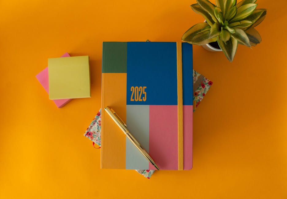
In visual content creation, color isn’t just an aesthetic element—it’s a communication tool. Your chosen hues guide how viewers feel, where they look, and how long they stay. In short: color drives both emotion and engagement.
- Warm tones (reds, oranges, yellows) create urgency, energy, and excitement
- Cool tones (blues, greens, purples) promote calm, trust, and sophistication
- Neutral bases (whites, grays, taupes) allow content elements to breathe and balance vibrant colors
2025’s Palette Prioritizes Intention
Looking ahead, color trends in 2025 are about more than surface-level appeal. Creators are turning to psychology-driven palettes that reinforce the message behind their content. A color is no longer just a color—it’s a deliberate storytelling choice.
Key directions to watch:
- Toned-down brights: Cheerful without being overwhelming; great for lifestyle and wellness content
- Saturated earth tones: Grounded and authentic, perfect for vlogs that focus on connection or minimalism
- Digital pastels: Soft yet striking—ideal for tech-forward and design-savvy creators
Mood-Boosting, Space-Shifting Colors
Video backgrounds, overlays, lighting setups, even wardrobe choices can contribute to the viewer’s experience. Colors can enhance perceived space and alter emotional tone—even when seen on a small screen.
- Use bright colors strategically to lift energy in key moments
- Apply darker hues to create depth or spotlight certain subjects
- Consider color grading to bring consistency across scenes
The bottom line: In 2025, color is no longer just a design decision; it’s a core narrative tool shaping how your audience feels—and responds.
Earth tones are getting a quieter reboot. Think clay, terracotta, ochre—but dialed down. These shades bring warmth without overwhelming a space. It’s a shift toward grounded color palettes that feel lived-in and natural.
The appeal? They straddle comfort and edge. These aren’t the loud reds and burnt oranges of past trends. They’re softened, subtle, and flexible—perfect for interiors that aim to feel contemporary but rooted. They help a space feel calm but not boring.
Best used in living rooms, kitchens, or reading corners, these tones pair well with organic textures—wood, linen, stone—and play nicely with low light. If the goal is a space that feels real and a little sophisticated, start here.
Think stormy skies just before dusk—that’s the vibe. Smoky navy and moody charcoal blues are everywhere, and they’re not going anywhere. These shades are calm without being sleepy, sharp without screaming for attention. It’s a move away from bright, bubblegum palettes to something more grounded.
Designers are leaning on these colors for spaces that need a sense of focus. Offices, bedrooms, even compact creative studios—they all benefit from the clarity and quiet authority that darker blues bring. Compared to pastels, which can feel airy or juvenile, deep blues offer sophistication without turning cold. They say, ‘get things done—but in style.’
It’s moody minimalism. And in 2024, it’s taking the lead.
Deep greens—forest, moss, olive—are making a quiet but steady comeback. They’re rich without being loud, grounded without feeling heavy. These tones anchor a space, giving it structure and texture, yet still leave plenty of breathing room. Livable, calm, and a bit moody in just the right way.
Used right, these greens don’t overpower. Instead, they play well with nature-inspired textures like raw wood, matte stone, or linen. Think a mossy feature wall behind a pale oak desk, or forest green cabinetry softened by brushed brass and cotton curtains. The result: a space that feels both intentional and easygoing.
Green isn’t bold right now—it’s balanced.
Call it lavender with a backbone. This isn’t the soft, floral hue of your grandma’s couch pillows—it’s a cooler, more silvery take that feels grown-up but far from stuffy. This purple has edge. It adds contrast to pale neutrals and rounds out stark white spaces without stealing the show.
The beauty of this shade is in the balance. It’s got mood without becoming heavy. Ideal for tight quarters where every color decision counts, it gives a small room some visual complexity without making it feel overdone.
If you’re working with a minimalist layout—or just trying to make 600 square feet feel less cramped—this tone plays well with clean lines and pared-down decor.
Want to see how it fits into a smart design strategy? Check the full guide: How to Use Minimalist Design to Maximize Small Spaces.
Warmer Whites Are In: Say Goodbye to Stark Interiors
The all-white, ultra-bright aesthetic that once defined modern interiors is starting to feel a little… cold. In 2024, it’s clear that the design pendulum is swinging toward warmth, comfort, and authenticity.
From Clinical to Cozy
Stark whites are being replaced with warmer tones that feel softer and more welcoming.
- Bright, sterile whites are falling out of favor
- Creamier palettes create a sense of lived-in elegance
- Soft undertones like ivory, oatmeal, and ecru are trending
The New Neutral Base
Warm whites act as the perfect canvas for design statements, offering flexibility and depth without overwhelming the space.
- Ideal for layering textures and materials
- Helps bold accent colors stand out without clashing
- Adds subtle richness to both modern and vintage spaces
Why It Works
Designers and homeowners alike are opting for interiors that feel serene and inviting. Warmer shades of white achieve this by blending lightness with a grounded, natural appeal.
- Reflect natural light without harshness
- Create continuity from room to room
- Pair effortlessly with earth tones, wood, and soft textiles
Charcoal is quietly taking the crown from black in design circles—and for good reason. It’s modern without being stark, edgy without overpowering. Unlike pitch-black, which can feel heavy and inflexible, charcoal plays nicer with other elements. It’s deep enough to add drama but soft enough to let texture shine.
Designers are leaning into charcoal as the new neutral. It anchors metallic finishes, warms up next to natural woods, and contrasts beautifully with vibrant textiles. Think burnt orange cushions, brass hardware, or walnut cabinetry pop against a charcoal backdrop without fighting for attention.
As high-contrast interiors stick around, charcoal steps in as the smarter base tone—less harsh than black, but just as bold. It offers flexibility, depth, and a timeless vibe that makes spaces feel grounded yet fresh.
Muted summer tones are stepping out of seasonal mode. In 2024, colors like pale citrus, faded mint, and dusty peach are showing up year-round, not just during warm months. They’re soft but not washed out—enough color to lift a space without shouting for attention.
Think of these shades as the quiet achievers. They play well with neutrals but add just enough energy to keep things feeling fresh. Ideal for accent walls, refurbished furniture, or even branded graphics, these tones are practical and versatile. You get warmth without commitment—clean, modern, and easy to update.
In a visual game like vlogging, your set design or on-camera aesthetic matters. These colors work just as well in a January livestream as they do in July BTS shots. Safe to say, they’ve graduated from summer fling to all-season staple.
Setting the Scene: Design Principles for Better Vlog Spaces
A solid vlog setup doesn’t need to be fancy—but it does need to be intentional. Start by locking in 2–3 key tones for your space. Think warm neutrals with black accents, or cool grays punched up with a bit of natural wood. The goal is balance, not clutter. Too many colors or textures distract. Stick with a tight palette across walls, props, furniture, and even your outfits.
Contrast matters. Soft meets structured is the sweet spot—like a clean desk against a textured backdrop, or natural fibers paired with metal fixtures. This adds depth without screaming for attention. It also helps separate you—the subject—from the scene.
And don’t forget lighting. Natural light is a gift when you have it, but it shifts. Supplement with soft artificial light that can be dialed in any time of day. A well-lit shot with even skin tones and subtle shadows can elevate your content instantly. Poor lighting can flatten it, no matter how good the story is.
Color in 2024: Purposeful, Personal, and Planet-Conscious
Color is no longer just about aesthetics—it’s about impact. In 2024, colors in interior spaces will be chosen not just for trendiness, but for functionality and emotional resonance.
Color With Intention
In the modern home and workspace, color will serve a purpose. Instead of arbitrary palettes, expect purposeful placement that supports mood and behavior.
- Calming tones for rest and recovery zones
- Energizing hues in creative and collaborative areas
- Focusing shades in work or study nooks
The goal? Spaces that feel good because they support your daily rhythms.
Sustainable Shades
Color trends are also being shaped by growing environmental concerns. It’s not just about how a color looks, but where it comes from.
- Natural pigments and dyes are gaining popularity
- Recycled and low-impact materials are influencing palette choices
- Brands are prioritizing eco-conscious production methods
This focus on sustainability leads to richer, more meaningful material stories in design.
Beyond Trends: Designing for Feeling
Rather than chasing color trends from fashion runways or viral posts, homeowners and designers are tuning into how a room makes them feel.
- Comfort and emotional connection are winning over novelty
- Designers are increasingly collaborating with clients to create personalized palettes
- The emphasis is on atmospheres—spaces that soothe, energize, or inspire based on individual need
In 2024, color isn’t just a design feature—it’s a foundational tool for creating intentional, feel-good environments.
 Ask Ireneia Diamondolls how they got into home repair tips and you'll probably get a longer answer than you expected. The short version: Ireneia started doing it, got genuinely hooked, and at some point realized they had accumulated enough hard-won knowledge that it would be a waste not to share it. So they started writing.
What makes Ireneia worth reading is that they skips the obvious stuff. Nobody needs another surface-level take on Home Repair Tips, Creative Concepts, DIY Renovation Ideas. What readers actually want is the nuance — the part that only becomes clear after you've made a few mistakes and figured out why. That's the territory Ireneia operates in. The writing is direct, occasionally blunt, and always built around what's actually true rather than what sounds good in an article. They has little patience for filler, which means they's pieces tend to be denser with real information than the average post on the same subject.
Ireneia doesn't write to impress anyone. They writes because they has things to say that they genuinely thinks people should hear. That motivation — basic as it sounds — produces something noticeably different from content written for clicks or word count. Readers pick up on it. The comments on Ireneia's work tend to reflect that.
Ask Ireneia Diamondolls how they got into home repair tips and you'll probably get a longer answer than you expected. The short version: Ireneia started doing it, got genuinely hooked, and at some point realized they had accumulated enough hard-won knowledge that it would be a waste not to share it. So they started writing.
What makes Ireneia worth reading is that they skips the obvious stuff. Nobody needs another surface-level take on Home Repair Tips, Creative Concepts, DIY Renovation Ideas. What readers actually want is the nuance — the part that only becomes clear after you've made a few mistakes and figured out why. That's the territory Ireneia operates in. The writing is direct, occasionally blunt, and always built around what's actually true rather than what sounds good in an article. They has little patience for filler, which means they's pieces tend to be denser with real information than the average post on the same subject.
Ireneia doesn't write to impress anyone. They writes because they has things to say that they genuinely thinks people should hear. That motivation — basic as it sounds — produces something noticeably different from content written for clicks or word count. Readers pick up on it. The comments on Ireneia's work tend to reflect that.